18/12/2014

Mogu Takahashi


There is little information on Takahashi I can find, or at least in English, but there is something so very charming about what she does. I first came across her work on her Instagram feed on which she documents her daily drawings. They're simple, childish and sometimes downright crude but I find them very lovely. Takahashi reminds me to be playful in my illustration.


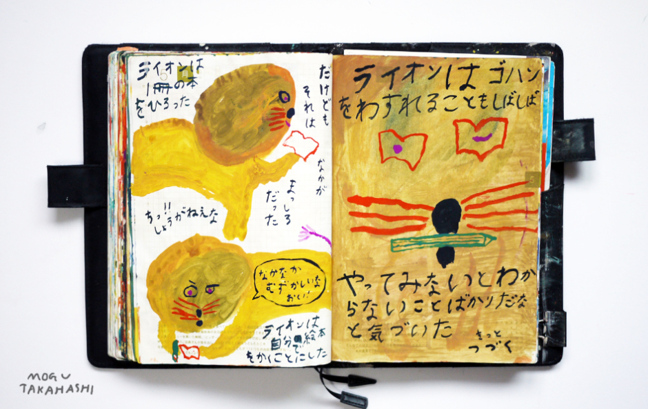
And not to mention the dedication of drawing everyday and more- and not just for work. Maybe I can follow Takahashi's footsteps as a new year resolution.


study task four: PPP christmas megatask

VISIT: itsnicethat / aoi / house of illustration
200 word summary of one site and why it is useful to you


It's Nice That provides a regularly updated smorgasbord of contemporary art and design. And those are the two things that draw me to it: its regularity and variety. It is both interesting and important to look towards the wider creative world as well as the illustration bubble. With an increasing amount of practitioners refusing to define themselves by a single section of the creative family it is also relevant.

Each article is short and sweet. At times it can feel like It's Nice That is just skimming over details but I feel that this is the point of INT, to open your eyes to a new thing so you can look at it further in your own time, should you choose to. It offers bite size snippets of creativity in a way I suppose microblogging websites like Tumblr try to offer but in a more professional and reliable context.

The work itself they post to the website is frequently something I am interested in aesthetically. It's important to be open to a wide range of visuals but I can't help but enjoy a lot of what is posted on this site.


--------------------

WHERE IS ILLUSTRATION ?

list at least 10 types of 
publications / places / websites / products
that demo where illustration is (not specific)

publications:

  • art publications
  • newspaper (article editorial)
  • zines
  • magazine (article editorial)
  • children's picture books
  • comics and graphic novels
  • book (cover)
  • text book diagrams
  • instruction manual (technical / respresentative illustrations)

places:

  • art galleries
  • billboards (adverts)
  • on the street (posters)
  • on the street (graffiti)
  • road signs
  • in court (court reportage drawings)
  • arts specialist (book)shops
  • arty eateries
  • comic book shop
  • art / illustration / comics festival


websites:

  • online version of an art publication
  • artist's portfolio
  • artist's blog
  • online art agency
  • online versions of newspapers (article editorials)
  • online games
  • apps
  • online advertising 
  • artists' social media
  • online shop: book / art 

products:

  •  CD / record (album artwork)
  •  greetings cards
  •  furnishings (textile/ surface design)
  •  ceramics
  •  art figurines
  •  food packaging
  •  product packaging
  •  stamps
  •  stationary
  •  toys


then find five examples of each

publications:

 The New Yorker

 Wrap Magazine

 July Zine by Eleni Karlorkoti

This One Summer, by Jillian Tamaki

 I Want My Hat Back, by Jon Klassen
places:

 The Gallery at Munro House, Leeds

Supalife Kiosk, Berlin

 Gosh! Comics, London

 ELCAF, London

Belgrave, Leeds
websites:

itsnicethat.com

heartagency.com

villagebookstore.co.uk

pingszoo.tumblr.com  /  whatdididraw.tumblr.com/

abouttoday.co.uk (lizzy stewart)
products:


 clothing by Lazy Oaf (Gemma Shiel)

 ceramics by Alex Sickling

 soaps by The Printed Peanut

vintage scandinavian stamps by Staffan Wiren

 Kitsune Maison album covers
and finally one example of each
and write why it is relevant to you

PUBLISHING: The New Yorker

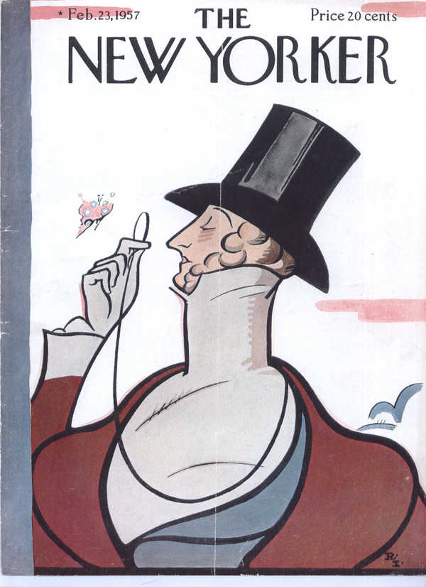
I would never go so far as to say that illustration in editorial is dying, but The New Yorker seems to hold this tradition closer to its heart than some other news publications.

PLACE: Supalife Kiosk

Supalife Kiosk, which I visited on a college trip to Berlin. It was interesting looking at the art scene local to Berlin, although they also stocked international titles. It was here I discovered tiny zines!

WEBSITE: Ping Zhu's blogs


Zhu, like many other illustrators has a tumblr blog dedicated to showcasing her work in a more informal manner. She also goes one step beyond and is brave enough to publish what some would consider her not very good drawings, and this creates a really interesting dynamic between the two blogs. Personally, I find the drawings on her latter blog sometimes as charming as her 'final' pieces, and that is a testament to those, rather than a detriment to the "better" ones.

PRODUCT: vintage stamps by Staffan Wiren

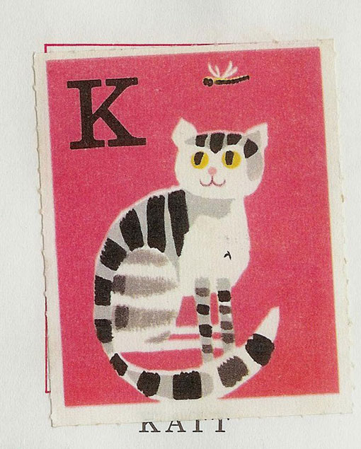
"Ingen rädder för ABC inte heller för 1-2-3": vintage Scandinavian stamps by Staffan Wiren. Sometimes I wonder if more care was taken into the design of everyday objects in the 1960s, but I am sure there must be plenty of 'average' and less so designs from then. As with anything, we take and keep hold of the nicer things of a period of time. Nostalgia is strong.


17/12/2014

Drew Millward talk @ LCA

some points I took from Drew Millward's visit

  • It's really interesting to look back at what media you consumed as a child and to see how aesthetically it influences you now. Thinking of that I wonder how different my work would be if I hadn't read the Richard Scarry series of books as a child!
  • Millward took his non-perfect prints and almost out of necessity made it an aesthetic. Good thinking, a compromise perhaps but not one that affects the integrity of his work.
  • Do your own thing and you'll probably get some work from it! Indulge your passions
  • It's hard being expected to produce the same work over and over, and he has found it liberating working in a simpler manner. However, sometimes certain clients, especially repeat ones, will expect you to work in your old ways and sometimes you have to sacrifice and cater to their needs.
  • Sometimes when you're stuck you just need to walk away from things for a bit. And this is why you shouldn't leave work to the last minute!
  • Be honest and upfront with clients about how long you expect a piece to take.
  • "Exhibitions are an easy way to lose money."

16/12/2014

late thoughts on Thoughtbubble

Thoughtbubble 2014 is only the second comics convention I have visited, my first being ELCAF earlier this year. I've found both conventions slightly odd experiences, mainly crowded and confusing. Maybe I will get into it. Although I talked to some illustrators, some I'd known online and some not at all, I found it difficult and awkward and it's something I'd like to be better at by the time the next one comes around!

I preferred what was on offer in terms of illustration and products at ELCAF, but appreciate the variety at TB. It was interesting to be surrounded by cosplayers for the first time- possibly one of the most unique reactions to illustration.

Although I spent a good deal of the day feeling a bit disorientated the highlights for me were the panels. I didn't spend any time at panels at ELCAF so again, this was a new experience.

Bee + Puppycat Panel:

  • Mainly just a fun event, but it was also learn more about the construction of animations and how studios work together. 

Artist Live Drawing:

  • The highlight of this were definitely the (sometimes terrifying yet humourous) quips of Boulet, but it was also interesting to hear illustrators talk about their daily working experiences, even if it was in a light hearted manner.

Diversity in Comics Panel:

  • I feel that a lot more could have been discussed in this panel if it wasn't for the limited time restrictions. In a turn I didn't expect a lot of the panel was focused on diversity at comics conventions themselves. 

16/11/2014

OUIL403 VISUAL SKILLS: END OF MODULE SELF EVALUATION

1.  Which practical skills and methodologies have you developed within this module and how effectively do you think you are employing them within your own practice?

I have begun to look at using shape as a means of image making. This was initially informed by my experiments in the OUIL404 Visual Language module but in using it in Visual Skills I have discovered how I can apply this to my more illustrative work. I’m finding that I prefer it as a tool to use and also as an aesthetic in other artists’ work.

Textures have also been prevalent in my practice for this module. I have used them in different ways for each studio brief. Most of the time these received positive feedback, though the use of digital textures received a mixed response and is something to be careful with.

2. Which principles/ theories of image making have you found most valuable during this module and how effectively do you think you are employing these within your own practice?

Before this module I did not pay quite as much attention to the importance of roughs and, the even rougher roughs, ‘scamps’. I have found them very helpful, though I feel like I could extend this even more by considering colour and media as well as just the composition when sketching these out.

I have also found working in prescribed formats helpful and also understand that this practice is closer to professional illustration practices than without.


3. What strengths can you identify within your submission and how have you capitalised on these?

I have been able to consistently work to deadlines with good time management (for this module). Although some of my work was not as I hoped I feel I have been able to successfully identify what had gone wrong (or just what had not been done) and evaluate how I plan to improve my practice. I feel that the work I have produced has been crafted well to a fairly high standard and thoughtfully produced (aesthetically at least).

4. What areas for further development can you identify within your submission and how will you address these in the future?

Often I find that my work can become very similar stylistically, and I am keen to produce and practice a diverse range of images. As I learn and experiment with media, tones of voice etc in OUIL404 Visual Skills I hope to be able to apply these to my work in other modules, like this one. And when OUIL404 has ended (and in other modules anyway) I hope to continue this practice of not being afraid to experiment.

I like to look at work that is very concept/ idea driven but I am finding, especially towards the end of this module, that I am finding it difficult to create, and portray, good ideas myself. It’s a very important part of illustration for me and I am disappointed that it was not one of my stronger points for this module.


5. In what way has this module introduced you to the Ba (Hons) Illustration programme?

Blogging in this format has been the newest concept for me. At the beginning I struggled a little but getting into the routine of blogging regularly, and in stages as a brief progresses has helped.

Having such short and busy briefs to work from has also been a new experience. I am finding that I am beginning to be able to work faster and arrange my time more in accordance to this.

09/11/2014

study task 3

For me, illustration is about:
  • Being a translation of reality. Illustration is here to record but not perfectly imitate real life. Illustration is a kind of fantasy, perhaps. It's here to add something new.
  • Being playful, and experimental in technique. It is nice to have a high level of crafting, and to look at something and know that a lot of  thought was taken in it's production, but sometimes the thought is put more into it's message, rather than its aesthetic. The key is to have a unique tone of voice!
  • Having a message. An illustration has something to say, or a job to do. It holds its own but can also be an addition to something else. 
  • Telling a story, through visual or sequential narrative. Storytelling is a love of mine, but also in an illustration having a message a narrative is, for me, inevitable and strongly tied.
  • Tone wise I favour heavily stylised work that still retains personality, often with a hand crafted charm. I have little interest in realism, but also the uber graphic. Shape and texture is very important, as well as quality of line and as I progress through the course I recognise them more and more. 

EXAMPLES OF WORK I FOUND WITH PINTEREST:

(here is my pinterest)


Character 

Luke Pearson
Not having Pearson's Hilda books to read as a child I feel like I have missed out, but I feel I can appreciate them as an adult nonetheless! The character development of Hilda and co is a strength of Pearson's. I also like how he has been able to capture character in image alone too. With no dialogue Pearson uses gesture and body language to convey the feelings of the giant.

Shape


Ping Zhu

I couldn't choose between these two artists for this category! What I love about Zhu's work is how she is able to capture such fluid movement. Her combination of shape and texture makes her work really unique.

Kunae Sato

On the other hand Sato's work is very flat and minimal, but still captures that essence of character and personality. I think it could be that the shapes themselves are clearly hand-drawn, their imperfections and naiveté offer something more than vector drawn shape work. 


Line

Margaret Bloy Graham

Perhaps there's a sentimental bias towards Bloy Graham's work but I do love it! The weight of her lines is very characteristic to the 1960s. There's a balance of playfulness and craft.

Marcus Oakley

On the other hand there is something crude but quite charming about the linework here in Marcus Oakley's illustration!

Composition ( + perspective)

Harriet Lee-Merrion

Lee-Merrion's illustration of Murakami's 'After Dark' fits the book perfectly. There's a sense of distance here between the viewer and the character created by the above angle composition, The lack of colour and minimal use of anything here fits the quiet atmosphere of the book.

 Texture + pattern


Laura Carlin
Carlin's work is very atmospheric and sensitive. The textures she uses compliment this. There's a sense of the artist's hand at work here.

26/10/2014

How can I become a successful freelancer?
  • (this seems to be one of the ultimate overarching goals for the degree, so working hard on this course is a good start! But also paying attention the voices of other, already working, illustrators, e.g. in Big Heads talks)

How does illustration interact with other disciplines?
  • Take note and part of/ in collaborations with other disciplines.

How does editorial illustration work and is it the right path for me?
  • Research editorial illustration as a discipline but also pay particular attention to projects which involve it. 
How can I price my illustration accordingly?
  • (I imagine this may be part of the PPP module, eventually)
(How) can self-publishing be part of a successful career in illustration?
  • Research illustrators and artists who have successfully incorporated, or made, a career with self-publishing. Research their methods and how this can be achieved.

How does illustration differ in print to digital media?
  • Investigate uses of illustration in 'the real world' and online. Look at how different techniques can be used on specific platforms and across the spectrum.

How can I make the most out of traditional print methods?
  • Experiment with a wide range of print methods in relevant workshops. Investigate as to how other illustrators and artists incorporate print into their work.
How do I use Adobe InDesign?
  • I shall attend relevant workshops, and strive to practice it out of allotted taught time.
How can I make the most of Photoshop?
  • I will attend relevant workshops, though I also have the facilities to practice this software at home.
How can I make really great illustration??
  • Pay attention to the world around you. Work hard. Think against the obvious.

01/10/2014

studio task 1

Ping Zhu
five reasons I chose illustration:

  • I really love to draw and make images 
  • ...And I'd love to somehow make that into a career
  • ...And learn how to make drawings that are more than just drawings. Something more interesting and with purpose.
  • I love storytelling and narrative and feel that illustration is the best way, for me, to do this
  • Illustration is such a wide and open subject. The possibilities are pretty endless and it is exciting!

Olle Eksell
five reasons I chose this programme:

  • As a new course, it seems fresh and promising (though there has already been a year to iron out the initial creases!)
  • It is a course that will be challenging! 
  • The course has a focus on the role of concept in visual communication as well as the technical image making side.
  • Great facilities. I am particularly interested in printmaking.
  • As a student of an FE course at LCA I imagined a degree course would be of a similar if not better level!

Margaret Bloy Graham
   
Jon McNaught

five things that are my strengths:


  • Character design
  • Digital work
  • Colour
  • Composition (sometimes)
  • Consistency, though at this point I am considering it more of a weakness!

 five things I would like to improve on:
  • My presentation skills
  • Developing other creative techniques, particularly in print and book making
  • Experimentation in media and content
  • Visual concepts
  • Research, particularly in historical contexts

Luke Pearson


30/09/2014

advice from second year students

  1. Blog as you go! 
  2. Don't be afraid to draw! Get over the feeling of self consciousness and embrace the mistakes.
  3. Enjoy yourself and engage in studio life to make the most out of this course!